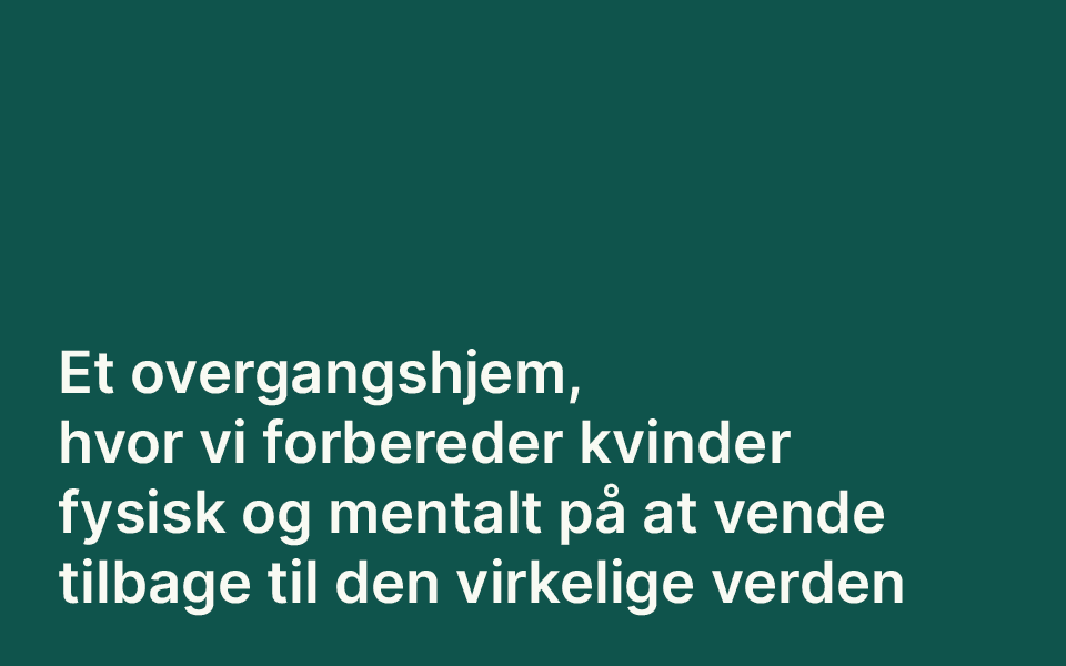
Haven krisecenter
Visual identity for a shelter home for women in crisis in Kalvehave on South Zealand design as part of my time at Urgent Agency. I was lead designer on the project from developing the concept, choosing the name for the place, and creating the final design.
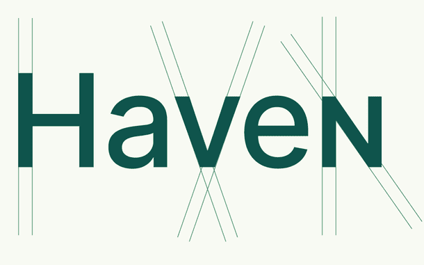
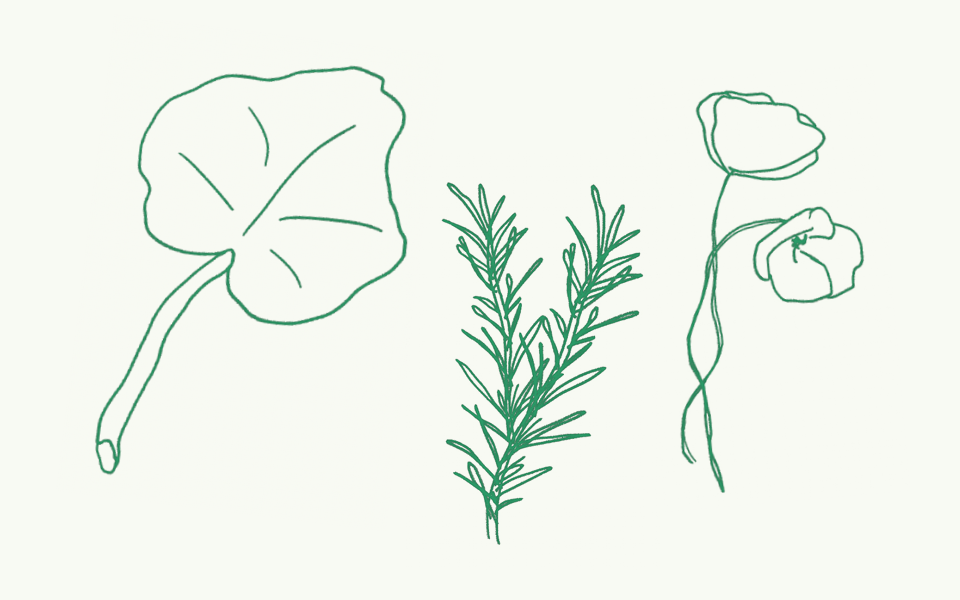
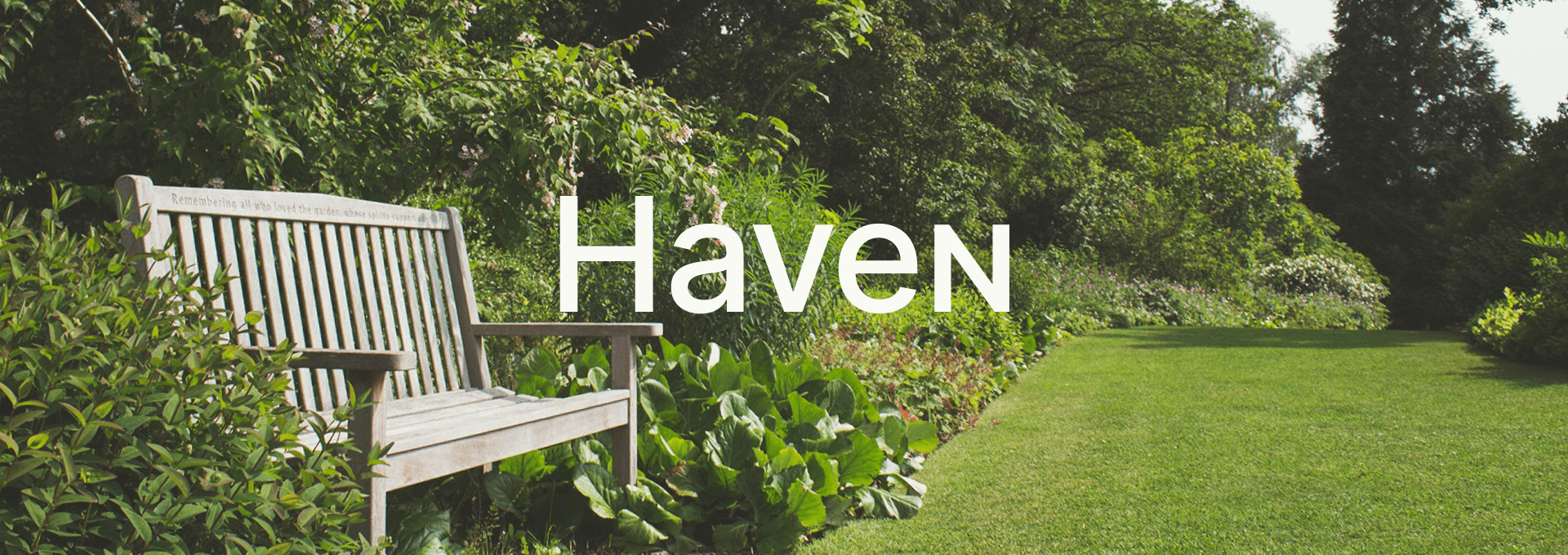
The name has an ambiguous meaning both referring to the city (Kalvehave) and the fact that the place has a beautiful, big garden which is rare for shelters like this. Furthermore, does haven means a safe or peaceful place.
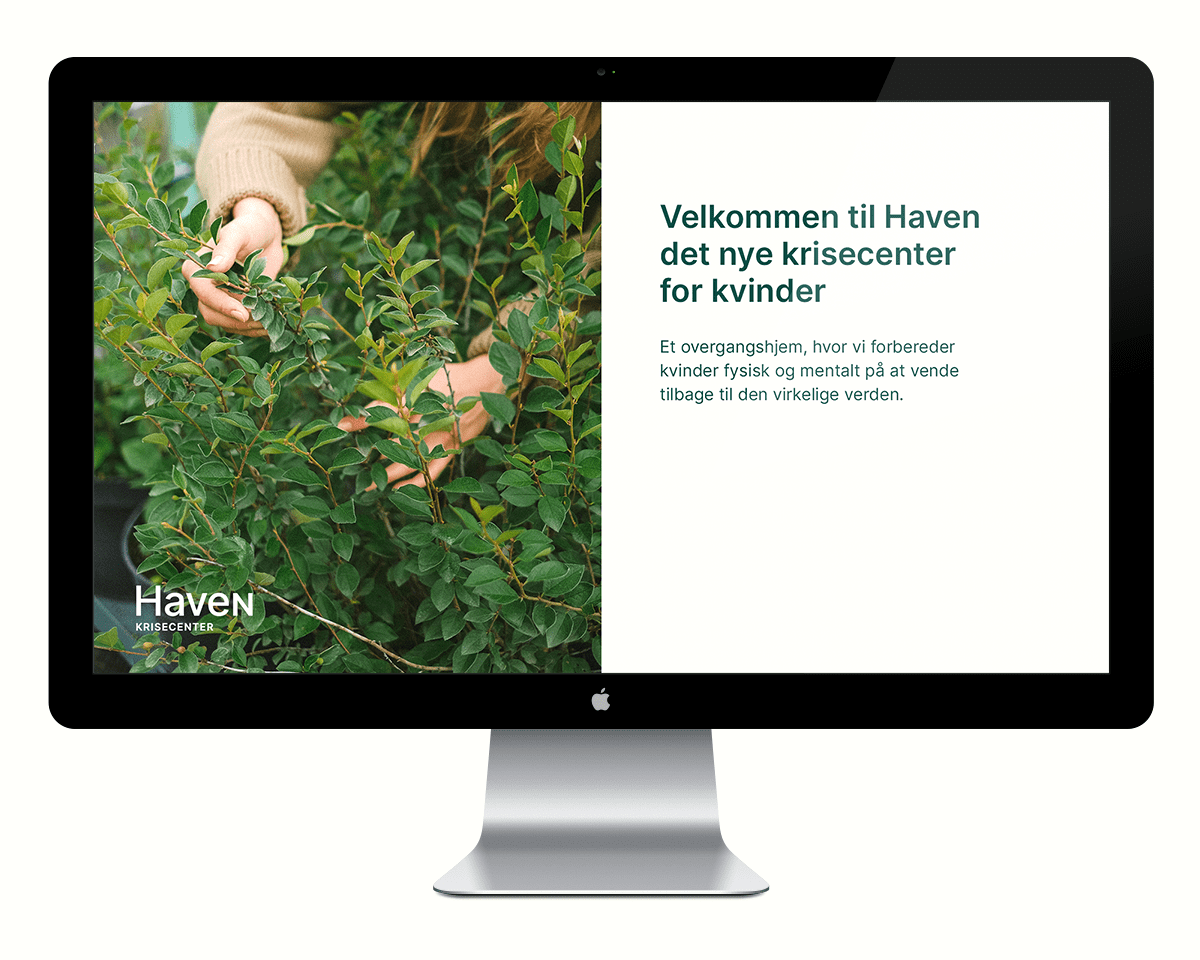
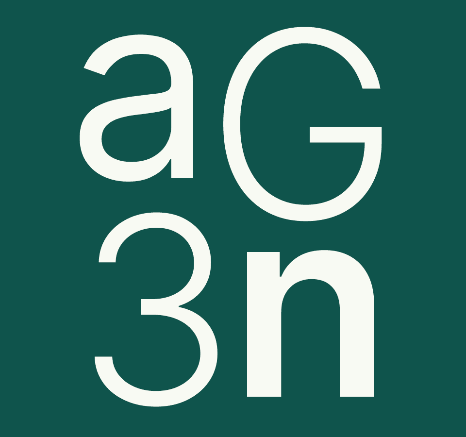
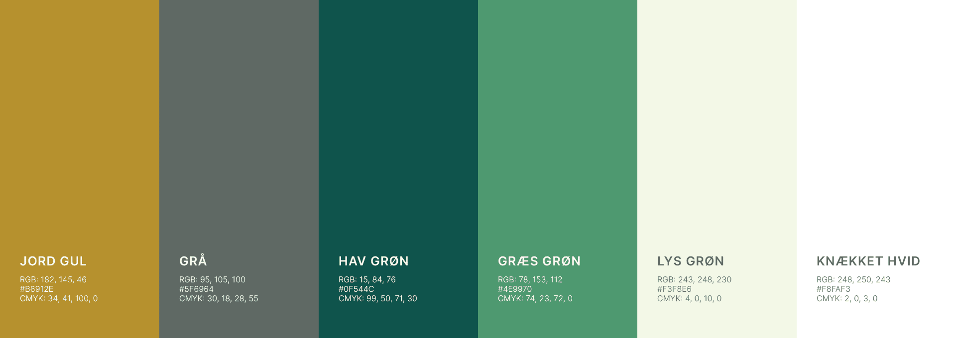
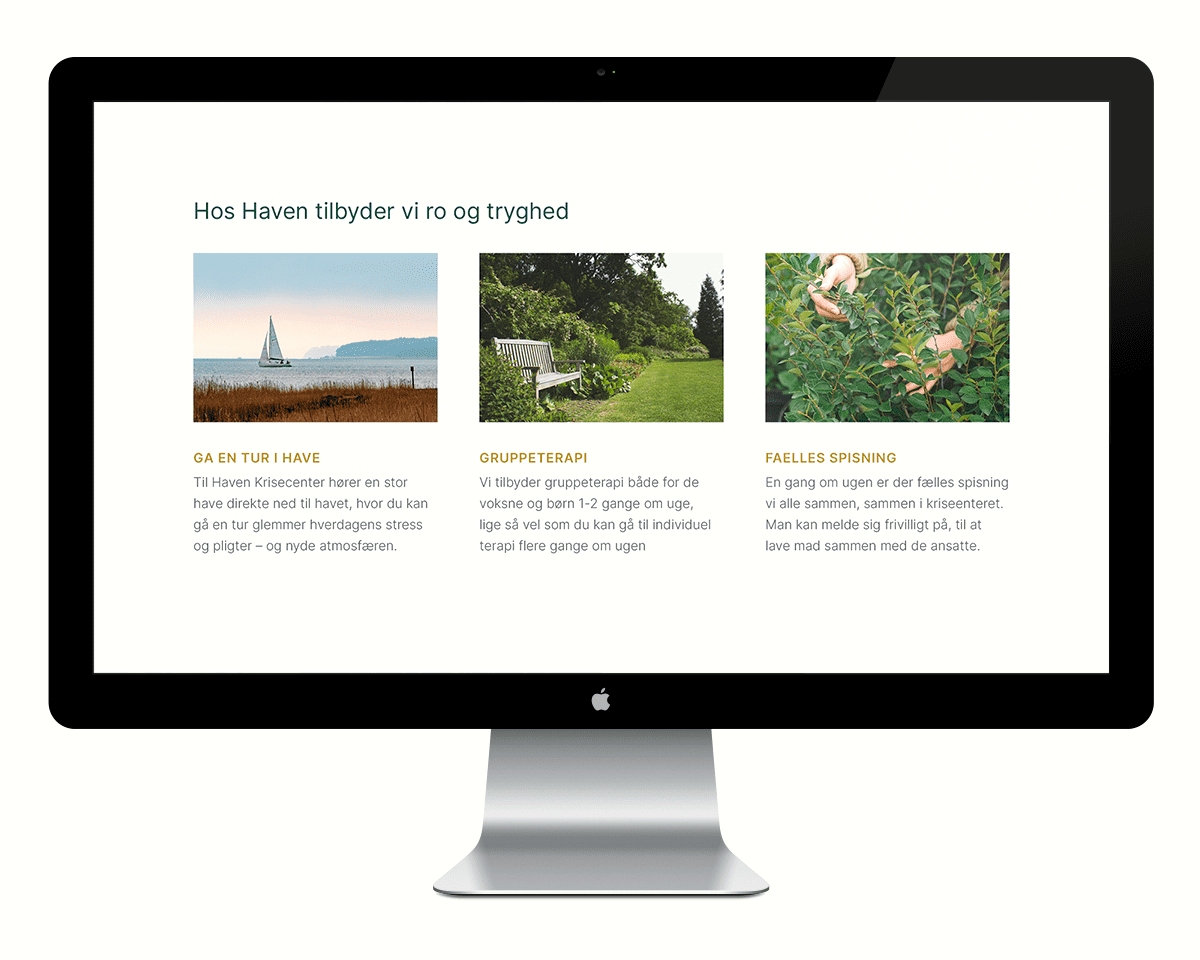
The identity is grounded, quiet but a the same time steadfast. The colors are taken from nature, and the font is mild and organic. Together it gives a calm and trustworthy feel to it. The picture style is telling a story about the people staying at the shelter, but without showing their faces. The images are only showing the surroundings and the hands of the visitors.